Project overview
Project type
School project
School project
Time
Spring 2024 (4th semester)
Spring 2024 (4th semester)
Tools
Figma/Figjam
Figma/Figjam
Design field
UX/UI-design, graphic design
UX/UI-design, graphic design
Team
3 interaction designers, 2 graphic designers, 1 web developer
3 interaction designers, 2 graphic designers, 1 web developer
My role
UX-designer
UX-designer
Project background
As part of a student project, we were tasked with redesigning the website for Samfundet Gjøvik -a historic event venue located in Gjøvik, Norway. The existing website lacked clarity, modern visual appeal, and a user-friendly structure, making it difficult for users to find information and book the venue.
Project goal
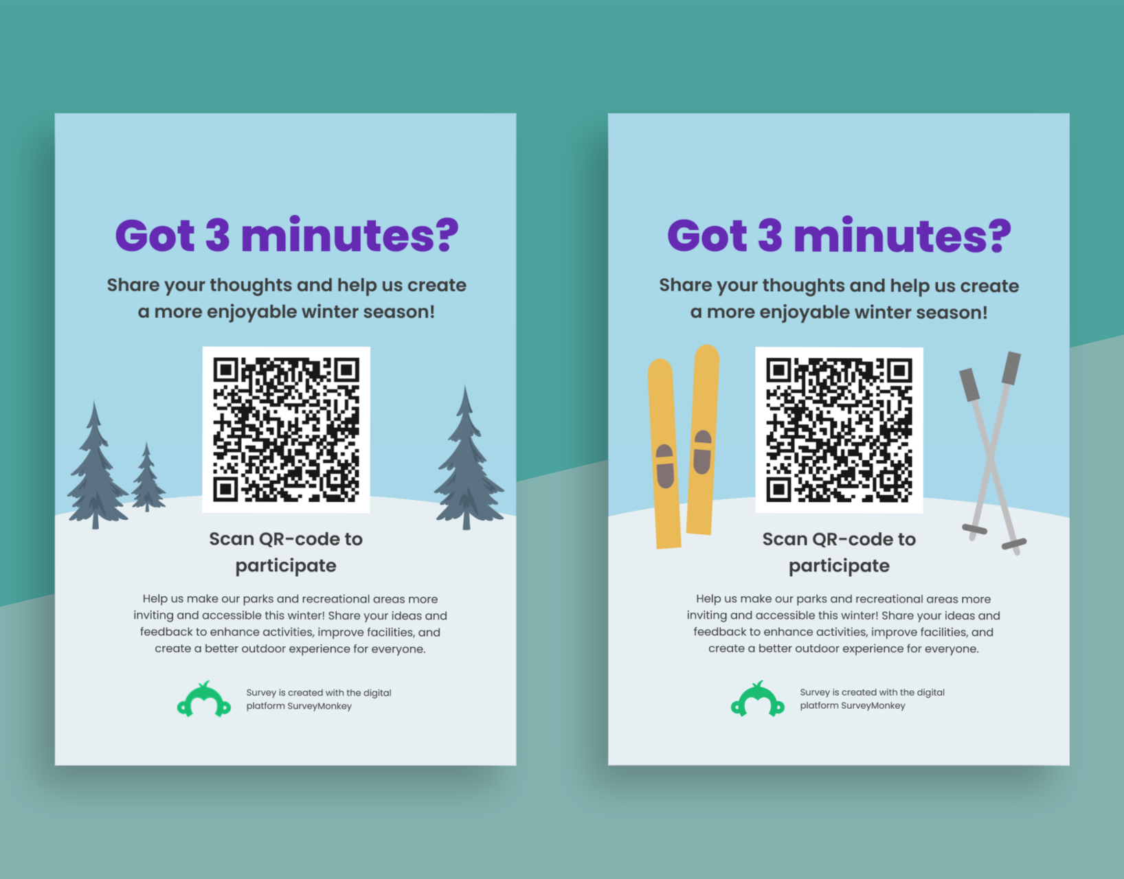
Our goal was to improve the overall user experience, highlight the historic atmosphere of the location, and design a more intuitive booking system that reduces friction for first-time and returning users. By creating a more user-friendly and visually appealing design, their website has a potential to get higher convertion of customers.
About Samfundet
Samfundet Gjøvik is a historic event venue located in the heart of Gjøvik, originally established in 1889. The building features a large main hall, intimate lounges, and a fully equipped bar, making it suitable for everything from concerts and conferences to weddings and private parties. Known for its classic architecture and central location, Samfundet remains a popular gathering place for both cultural and social events in the region.
Design process
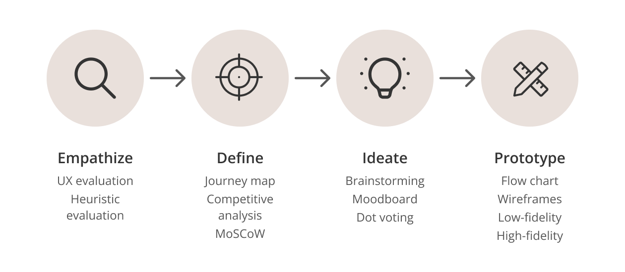
Model showing the design process (empathize, define, ideate, prototype).
Methods
• Empathize: UX-evaluation, heuristic evaluation
• Define: Journey map, comptitive analysis, MoSCoW
• Ideate: Brainstorming, moodboard, dot voting
• Prototype: Flow chart, wireframes, low,fidelity, high-fidelity
• Define: Journey map, comptitive analysis, MoSCoW
• Ideate: Brainstorming, moodboard, dot voting
• Prototype: Flow chart, wireframes, low,fidelity, high-fidelity
My contributions
• UX-evaluation
• MoSCow
• Brainstorming, moodboard, dot voting
• Wireframes, low-fidelity
• MoSCow
• Brainstorming, moodboard, dot voting
• Wireframes, low-fidelity
Existing solution
General issues
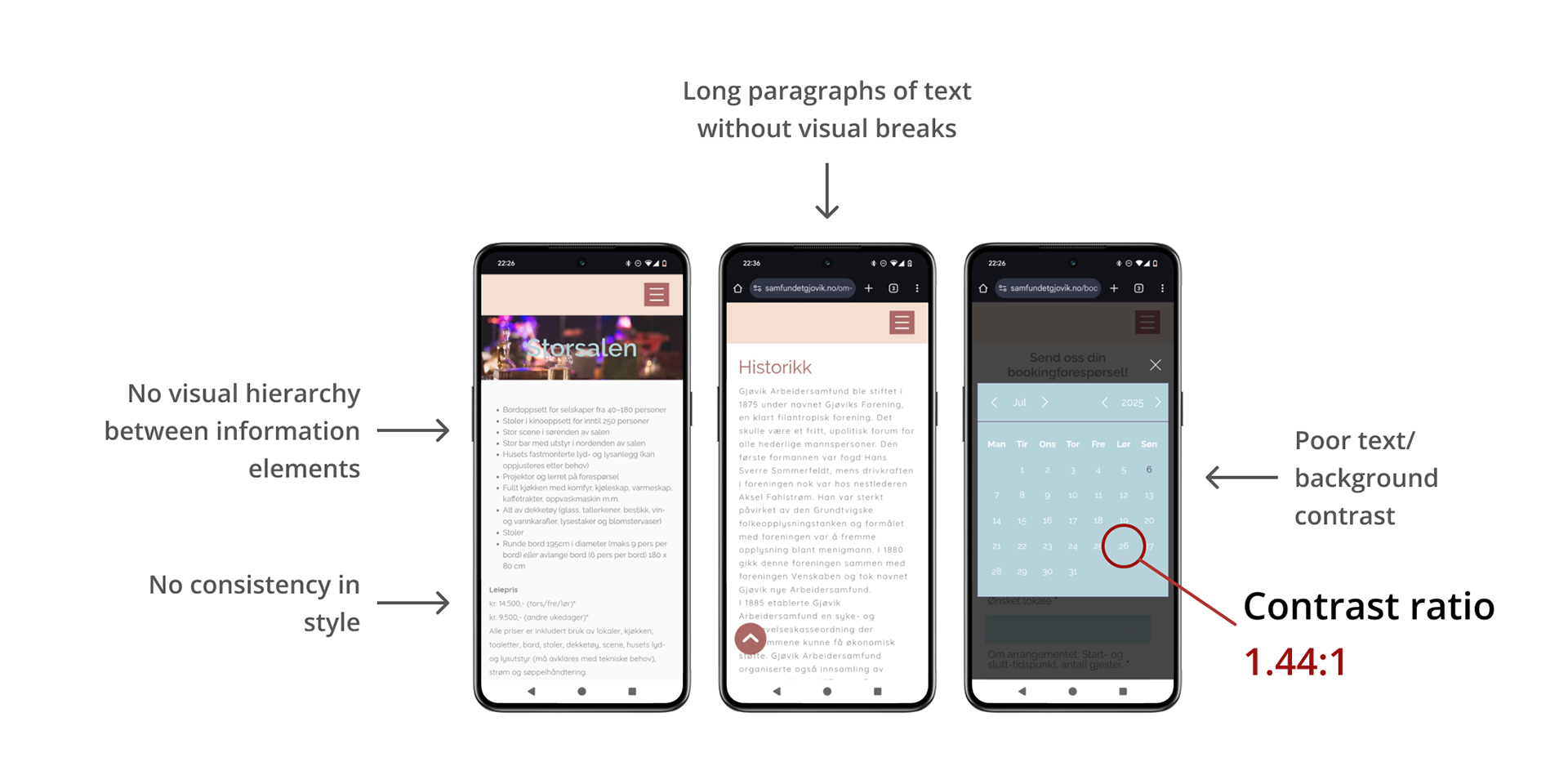
Highlights of the key issues of the existing solution.
• Too low contrast between text/background, causing severe issues with readability, accessibility, and WCAG.
• No design manual, causing inconsistencies in font styles, color use and spacing.
• Long text paragraphs without visual breaks, which makes reading feel "heavy" for users.
• Poor hierarchy and organisation of information elements, making it unnecessary difficult and annoying trying to find relevant information
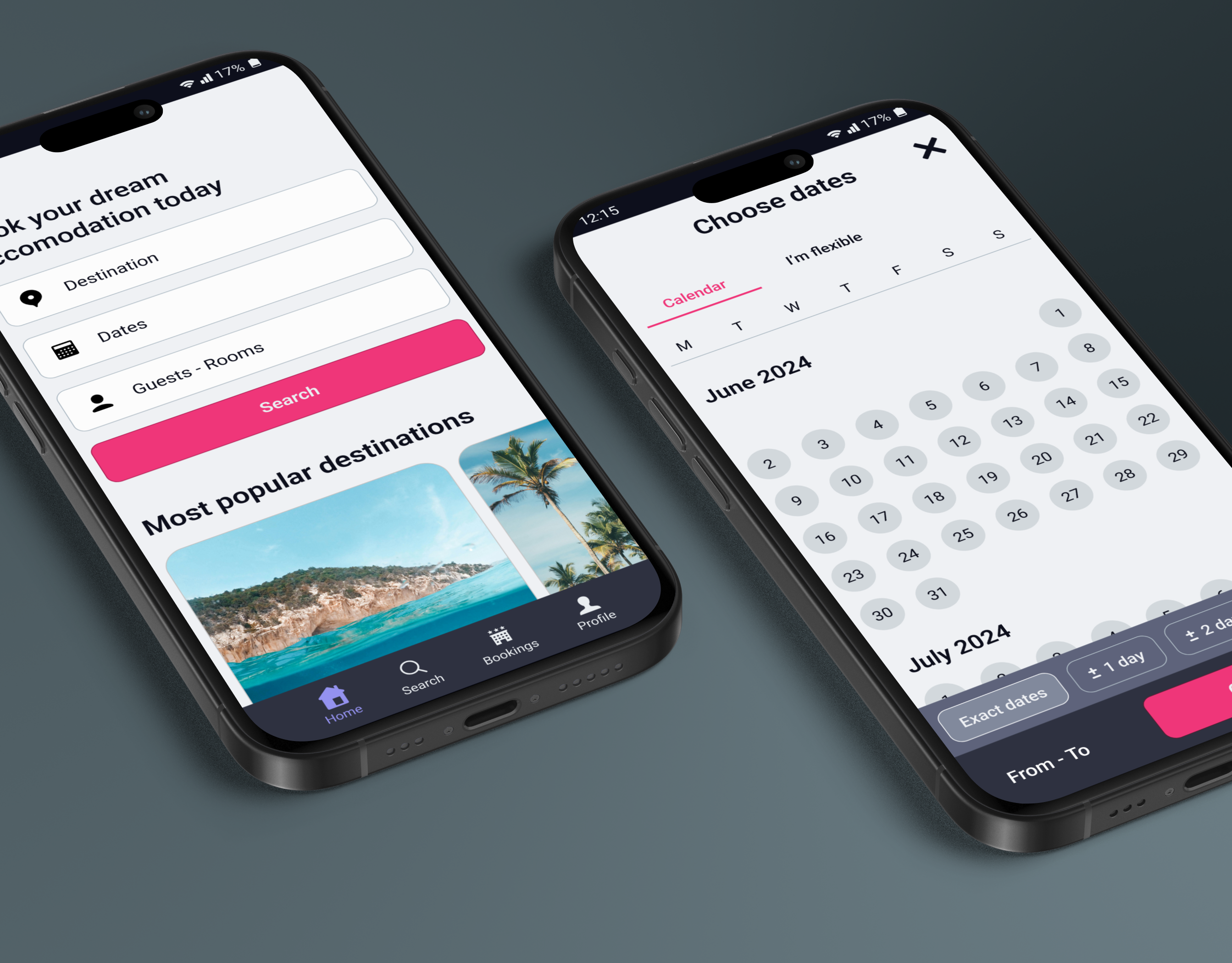
Booking system
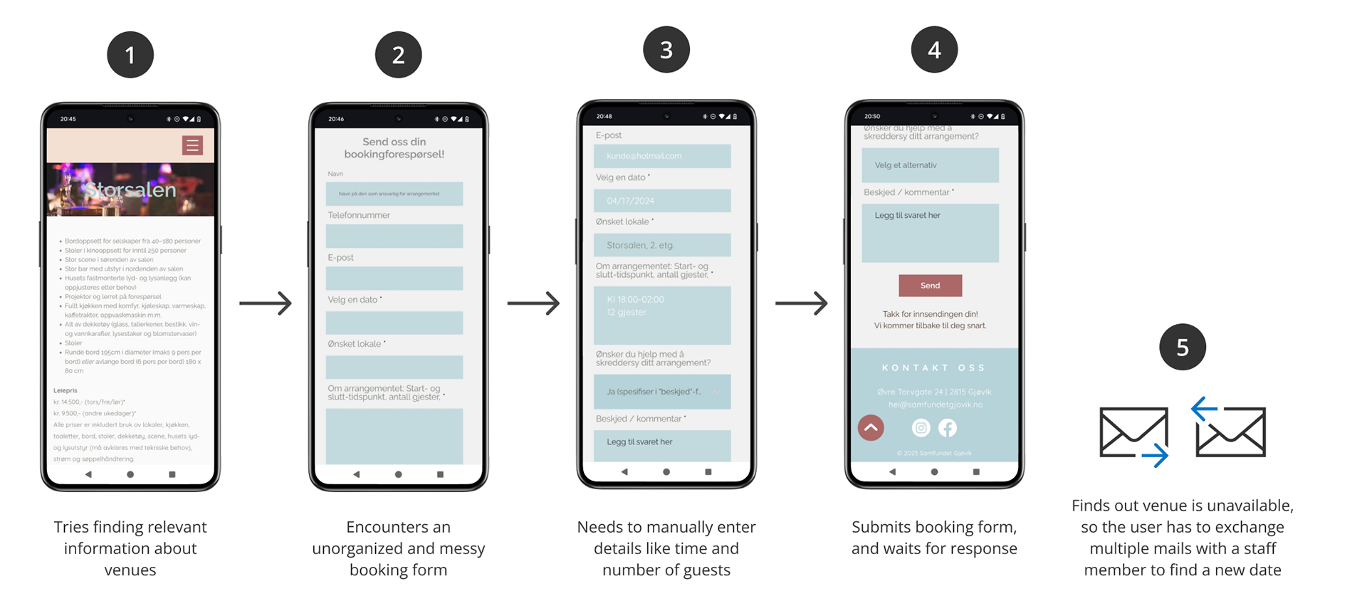
Current booking system.
1) Before booking, users must navigate through several cluttered and poorly structured pages to find essential information about the venues, making it difficult to make a decision.
2) When booking the venue, they encounter a disorganized and messy booking form with hard-to-read text.
3) They are required to manually type in details such as time and number of guests.
4) After submitting the form, they must wait for an email response from a staff member to confirm whether the venue is available.
5) If the venue is unavailable, the user and staff often have to exchange multiple emails to find an alternative date.
Development
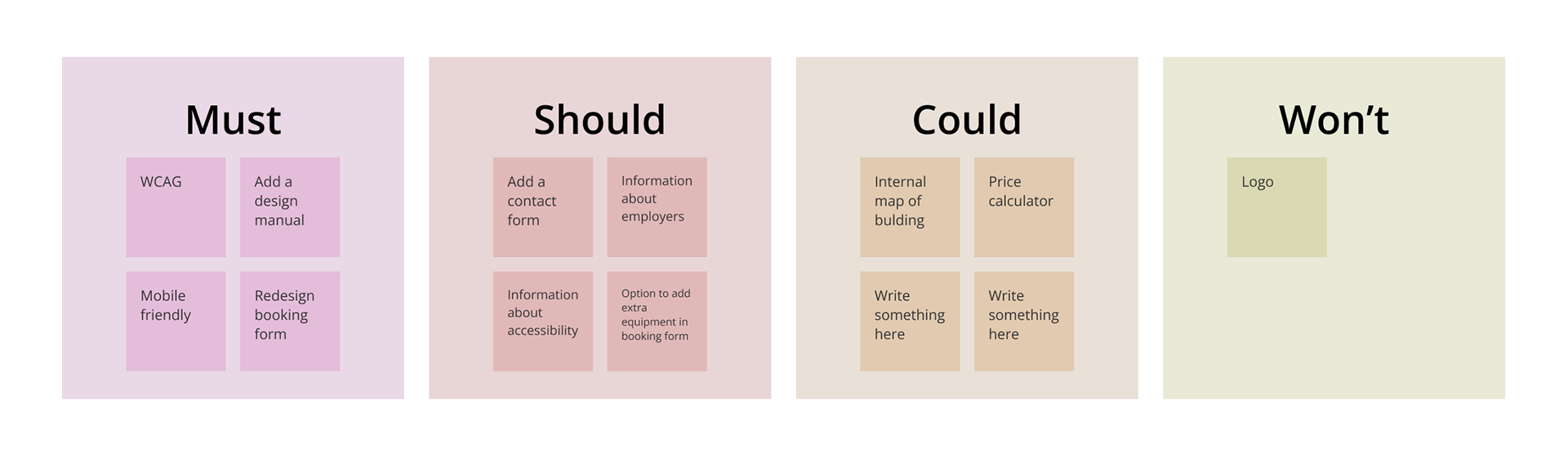
MoSCoW-prioritization chart.
Following the UX evaluation, our main priorities before the deadline were to develop a new design manual, ensure mobile responsiveness, and redesign the booking form. These priorities were defined using a MoSCoW chart (see image above).
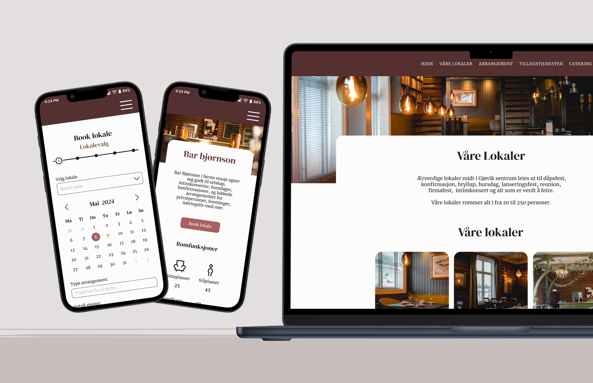
Wireframes
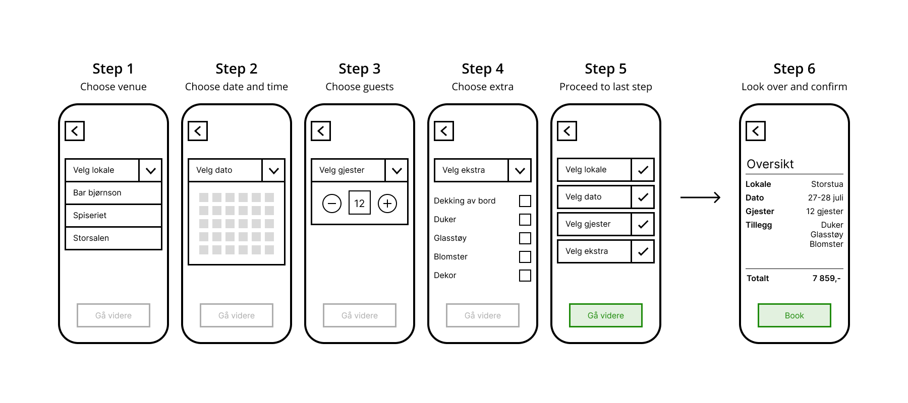
Wireframe showcasing a new proposal for an alternative booking system.
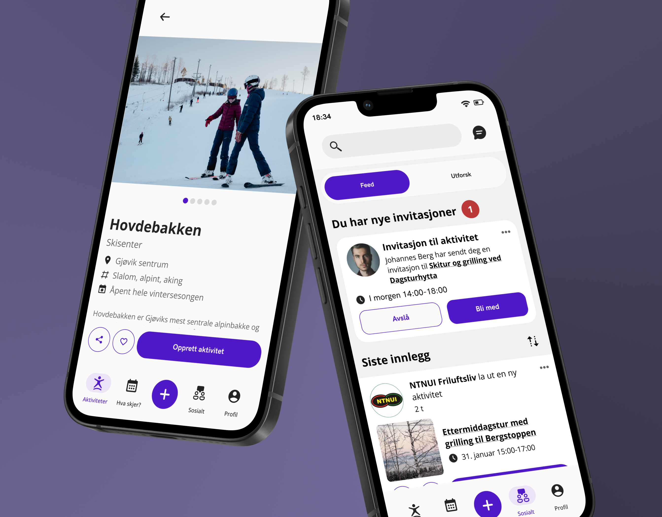
One of my main responsibilities was to propose a new design for the booking system. I initially created a vertical dropdown layout to emphasize user progress, but this was later replaced with a progress indicator for improved clarity (see the 'Final Results' section below).
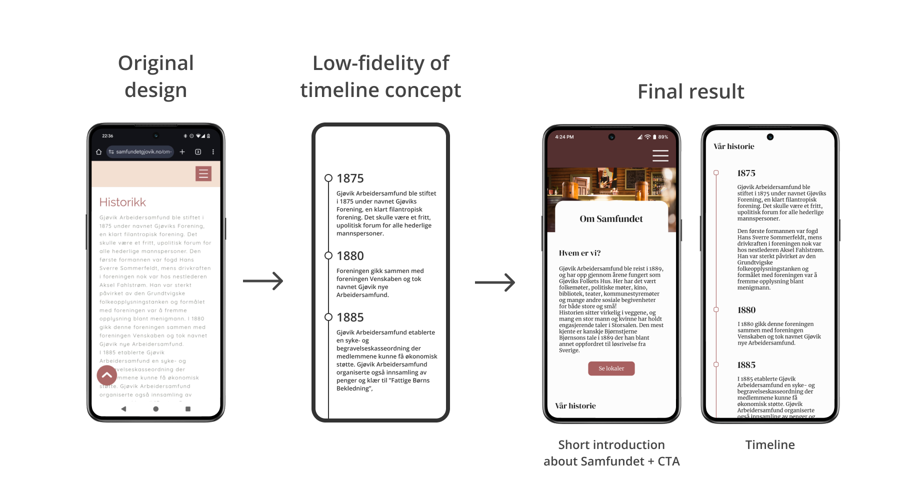
Redesign of the About page of Samfundet
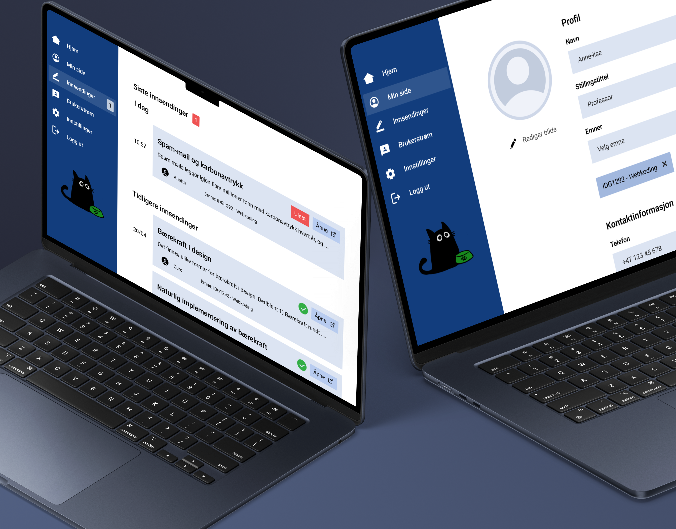
Another key task I worked on was redesigning the 'About' page, which presents information about Samfundet and its history. To improve readability and provide a clearer overview, I replaced the long block of text with a visual timeline.
Final result
New booking form
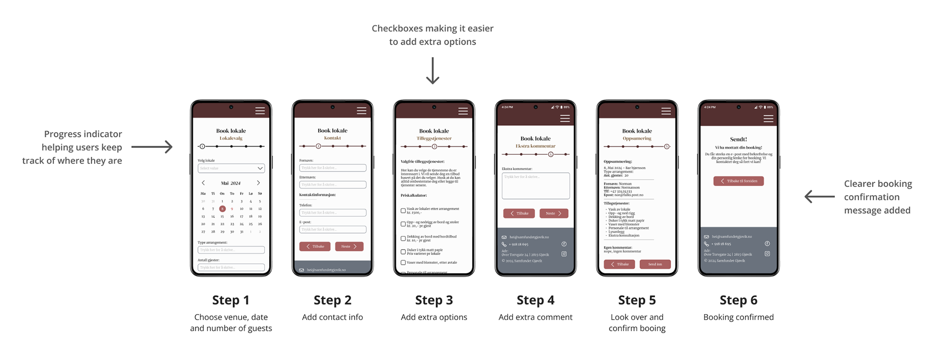
The design of new booking form.
The final version of the booking form introduced several key improvements:
• Rather than presenting all fields at once, the form is now divided into multiple steps for a more manageable user experience
• A progress indicator was added to clearly show users where they are in the booking process
• The form also features checkboxes for easier input
• A clearer confirmation message upon completion of the booking form
Design system
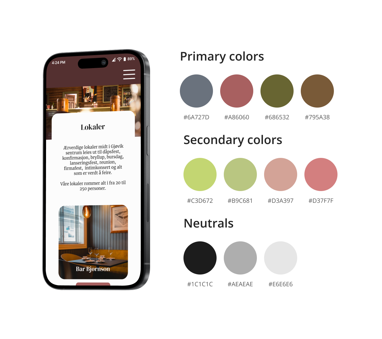
New color palette for Samfundet
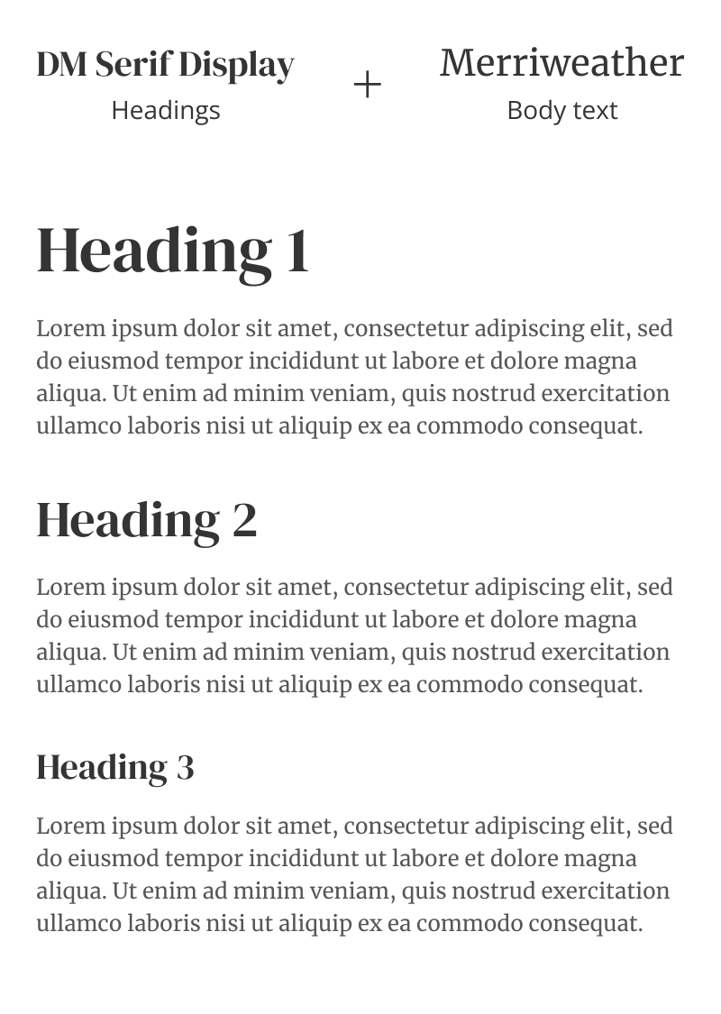
New font hierarchy for Samfundet
The new design introduced updated fonts, colors, icons, and spacing to create a more cohesive and visually engaging experience. Natural, earthy tones were used to reflect the historic atmosphere of Samfundet and strengthen its visual identity.
The typefaces DM Serif Display (headings) and Merriweather (body text) were chosen to reinforce the traditional and timeless character of the venue.
Reflection
What I've learned
• Collaborating in an interdisciplinary team with graphic designers and web developers
• How ineffective use of hierarchy and information architecture can significantly hinder task completion on a website
• Better understanding about working with design systems in Figma (despite not having the main responsibility for this part).
• How ineffective use of hierarchy and information architecture can significantly hinder task completion on a website
• Better understanding about working with design systems in Figma (despite not having the main responsibility for this part).
What could be improved
• Conducting usability testing with real users from the target group would have provided more valuable insights and validation.
• Given the presence of multiple user types (e.g., visitors and employees), incorporating a service design perspective could have enhanced the overall user experience and addressed broader touchpoints.
• Given the presence of multiple user types (e.g., visitors and employees), incorporating a service design perspective could have enhanced the overall user experience and addressed broader touchpoints.