Design field
UX-design
UX-design
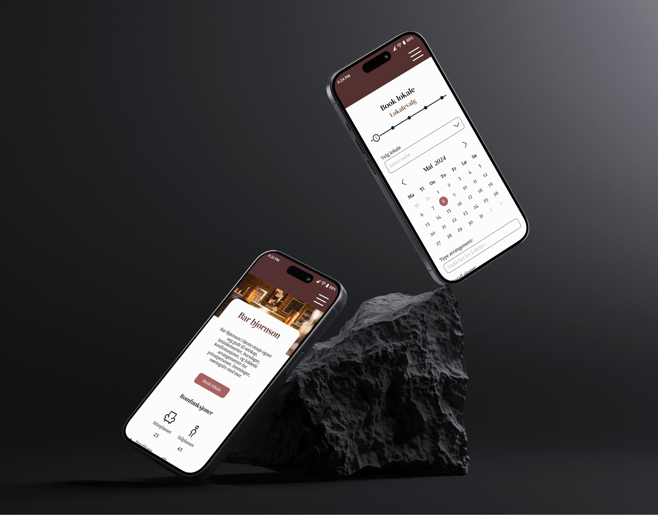
Tools
Figma
Figma
Time
Spring 2025
Spring 2025
Team
Individual
Individual
The problem
Gjøvik municipality in Norway has many outdoor areas and facilities for recreation, social gathering and physical activity. However, many residents in Gjøvik don’t utilize the accessible outdoor areas—despite the benefits for health, physical activity and social engagement.
The solution
An app that encourages residents to use the recreational activity areas through features making it easy to connect with new people, groups and organisations. The features encourage physical actvitiy by promoting a sense of belonging and community.
The design process
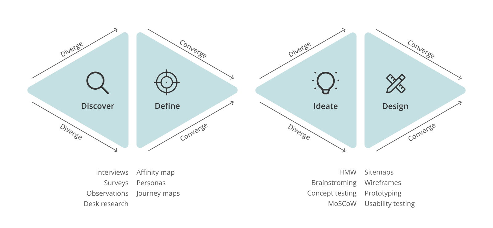
• Discover: Interviews, surveys, observations, desk research
• Define: Affinity map, personas, journey maps
• Ideate: HMW-statements, brainstorming, concept testing, MoSCoW
• Design: Sitemap, flow chart, low- and high-fidelity prototyping, usability testing
• Define: Affinity map, personas, journey maps
• Ideate: HMW-statements, brainstorming, concept testing, MoSCoW
• Design: Sitemap, flow chart, low- and high-fidelity prototyping, usability testing
Research & insights
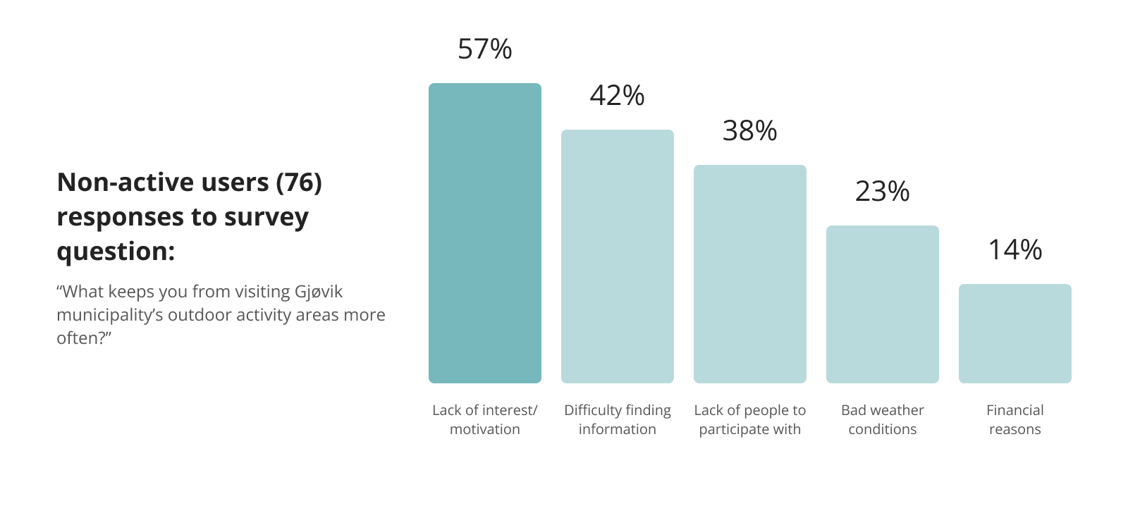
Insights from interviews, surveys, observations and desk research. revealed three main challenges preventing residents from visiting local activity areas:
1) Lack of motivation
2) Difficulty finding information
3) Lacking people to participate with
2) Difficulty finding information
3) Lacking people to participate with
Persona & user journey
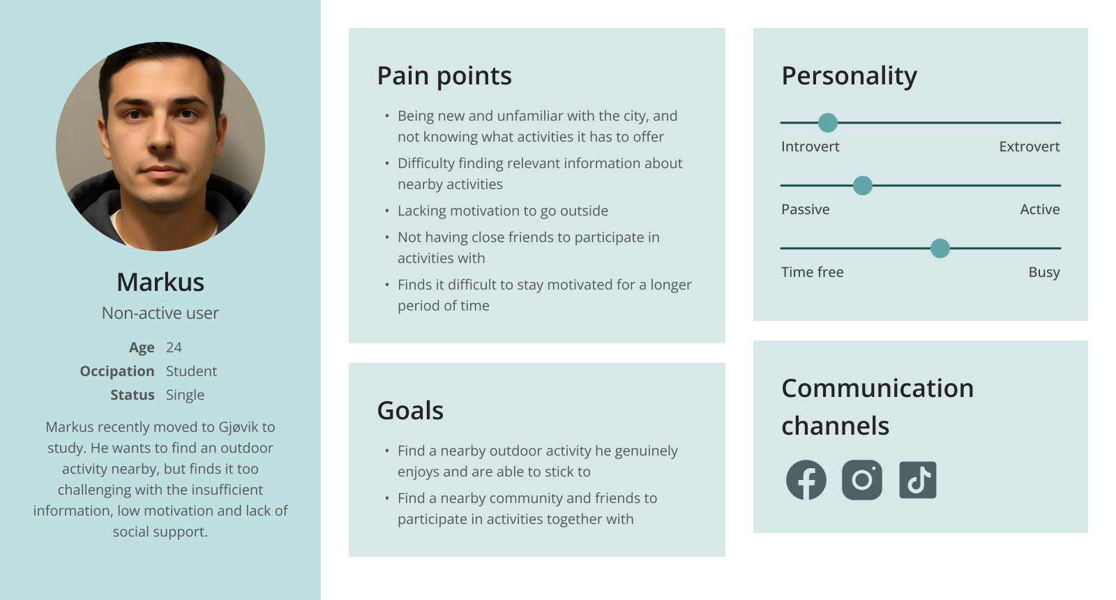
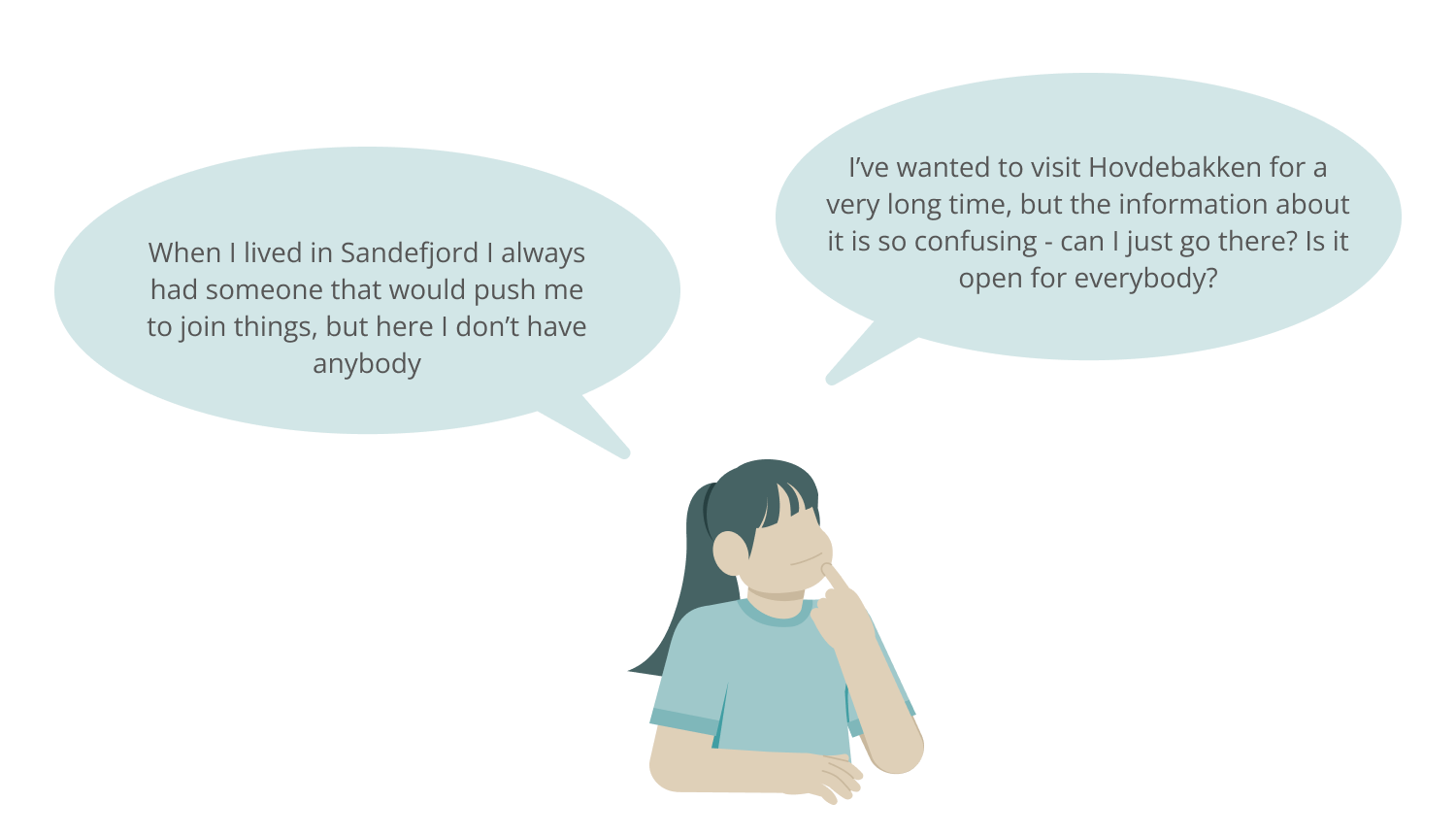
Markus (24) is a persona that represents non-active users. He recently moved to Gjøvik to study. Although he enjoys outdoor activities, he struggles with motivation and doesn’t know where to find reliable information or people to join him.
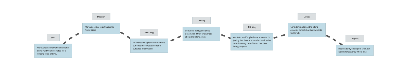
In Markus' user journey he decides to change his situation. However, the challenges with finding relevant information and people to join with kills his motivation, and fails to do the changes.
Ideation & concept development
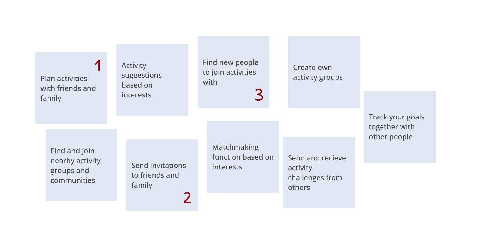
To explore potential solutions, I brainstormed a wide range of ideas that were presented to potential end users. I conducted dot voting where 8 participants ranked their top three ideas, which helped highlight the most popular and relevant directions.
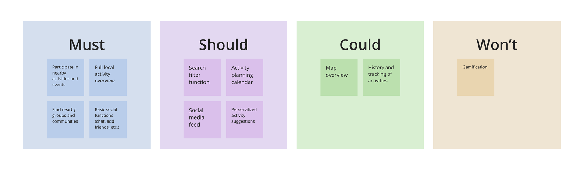
To prioritize the features and decide which concepts to take forward into prototyping, I applied the MoSCoW-method (must, should, could & won't have)
Sitemap
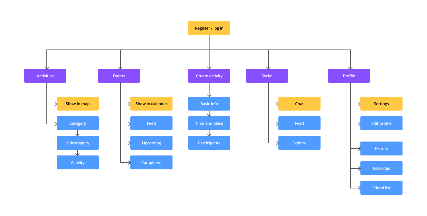
Early in the prototype stage, I created a sitemap to structure the content and define the page hierarchy. This gave me a clear overview of navigation and ensured a logical user flow.
Low-fidelity
I went on to developing a low-fidelity prototype containing the core functions and simple navigation structure. This allowed for early feedback on layout, navigation, and functionality before investing time in visual details.
Testing & iteration
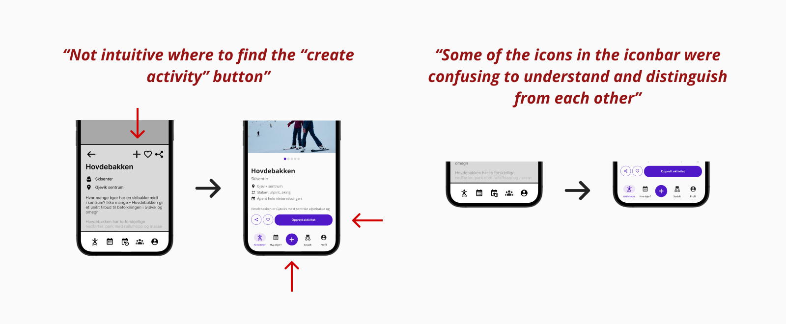
Early user testing with 3 participants provided valuable insights into the functionality of design, and where usability improvements can be made.
The test participants highlighted confusion around navigation when performing various tasks. For example, it was suggested making key actions like "create activity" more clear and intuitive to find.
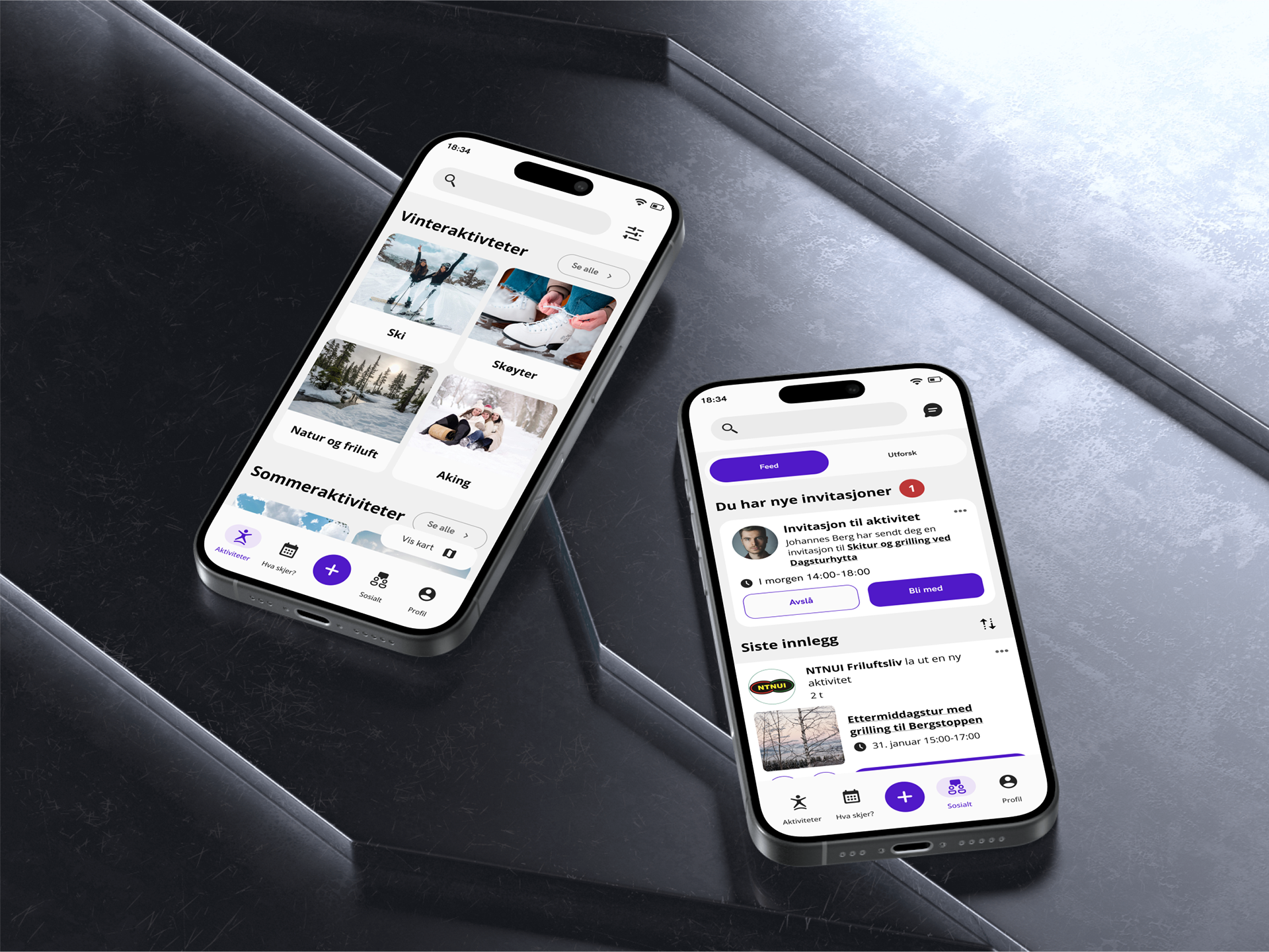
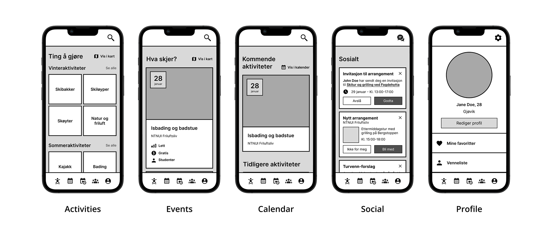
Final product
The final product is an user-friendly solution that helps people easily discover nearby activities and join events together with others.
The core functions in this solutions are:
• Map and list overview of nearby activities
• Calendar showing events created by local activity organisations
• User feed showing, and social functions enabling users to find people nearby to participate in activities with
• A profile section that provides an overview of the user's interests and their history of participation
• Reminders and personalized suggestions based on previous activity
What I've learned
• How different user groups experience outdoor spaces
• How small design decisions - like using red color on a notification or changing the placement of a button - can significantly impact a user’s decision to engage
• How motivation, accessibility, and community all play a role in encouraging active lifestyle
• How small design decisions - like using red color on a notification or changing the placement of a button - can significantly impact a user’s decision to engage
• How motivation, accessibility, and community all play a role in encouraging active lifestyle
Further development
• Testing the app in real-world scenarios with a broader user base
• Personal tracking of progress and history of participation
• Gamification elements and reward systems
• Language preferences
• Web-based version of the design
• Personal tracking of progress and history of participation
• Gamification elements and reward systems
• Language preferences
• Web-based version of the design