Design field
UX/UI-design
UX/UI-design
Time
Spring 2023
Spring 2023
Tools
Figma
Figma
Team
3 UX-designers
3 UX-designers
The problem
The existing website for Vardal Turn is visually outdated and lacks clear structure, making it difficult for users to find essential information about events and training sessions.
The solution
A redesigned solution featuring enhanced information architecture, mobile responsiveness, and improved usability.
Design process
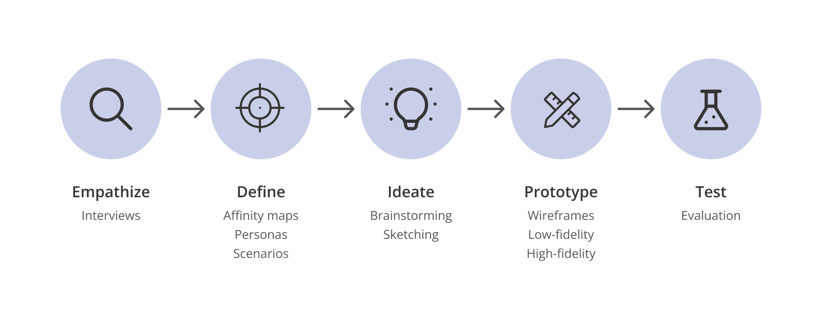
• Empathize; Interviews
• Define: Affinity map, personas, scenarios
• Ideate: Brainstorming, sketching
• Prototyping: Wireframing, low-fidelity, high-fidelity
• Test: Evaluation
• Define: Affinity map, personas, scenarios
• Ideate: Brainstorming, sketching
• Prototyping: Wireframing, low-fidelity, high-fidelity
• Test: Evaluation
Research & insights
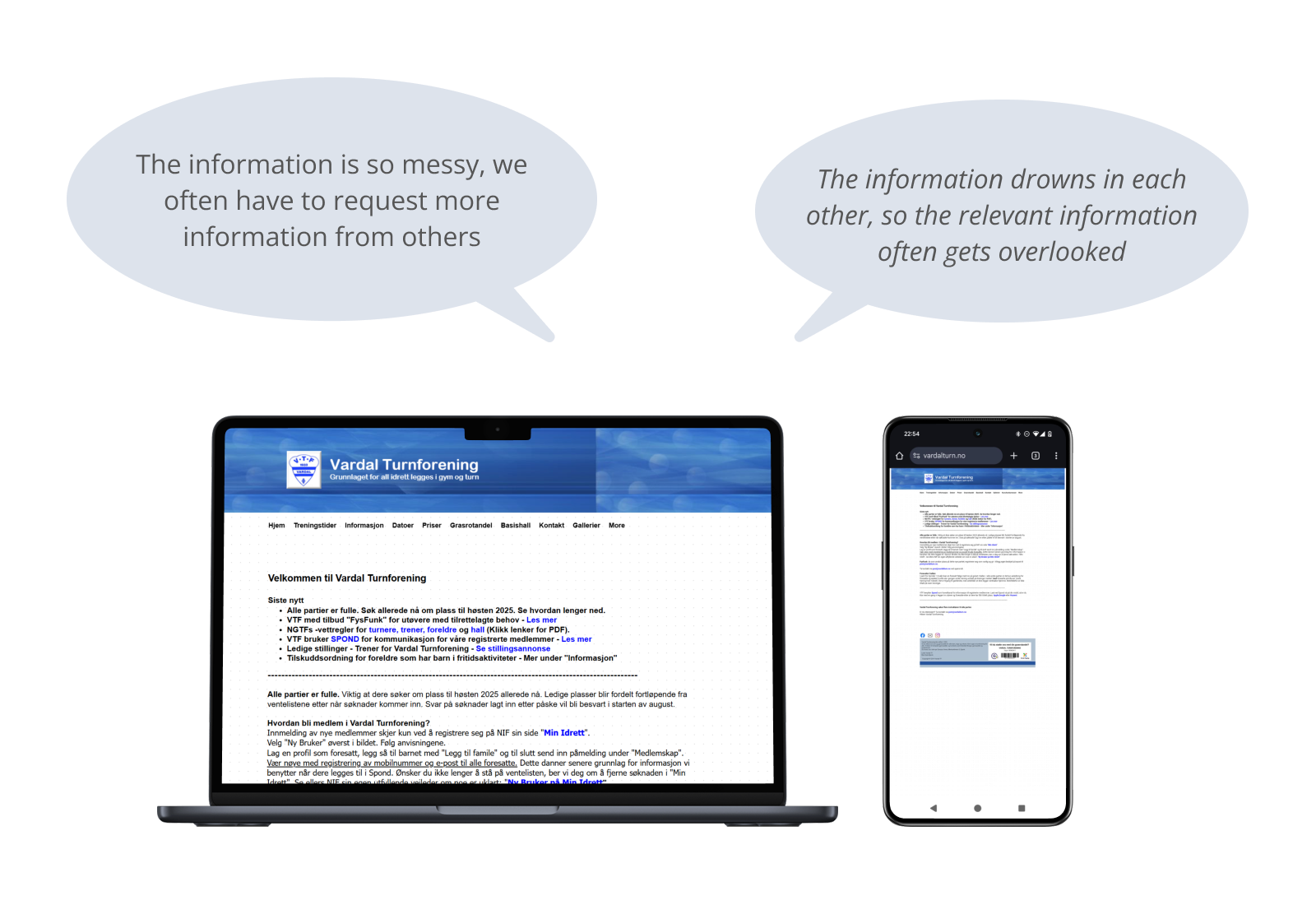
UX-evaluation and several interviews with gymnastics, parents and administration revealed the following key issues with the page:
• The information on the web page is messy and disorganized, making it hard to find relevant information
• Users have to utilize multiple platforms to manage its activities
• Information tend to drown within each other
• The information on the web page is messy and disorganized, making it hard to find relevant information
• Users have to utilize multiple platforms to manage its activities
• Information tend to drown within each other
Personas
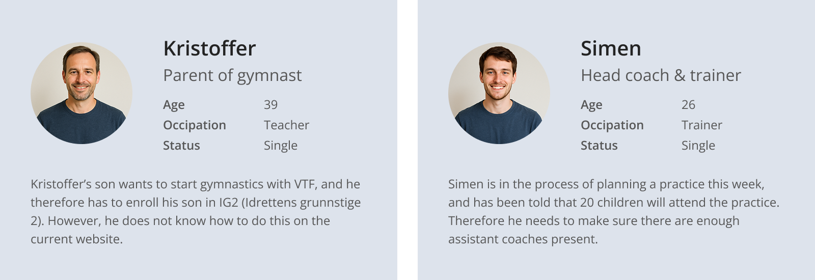
We created simplified personas representing gymnastics parents and trainers. Kristoffer is a parent who wants to register his child as a gymnast, while Simen is a head coach and trainer.
Scenarios
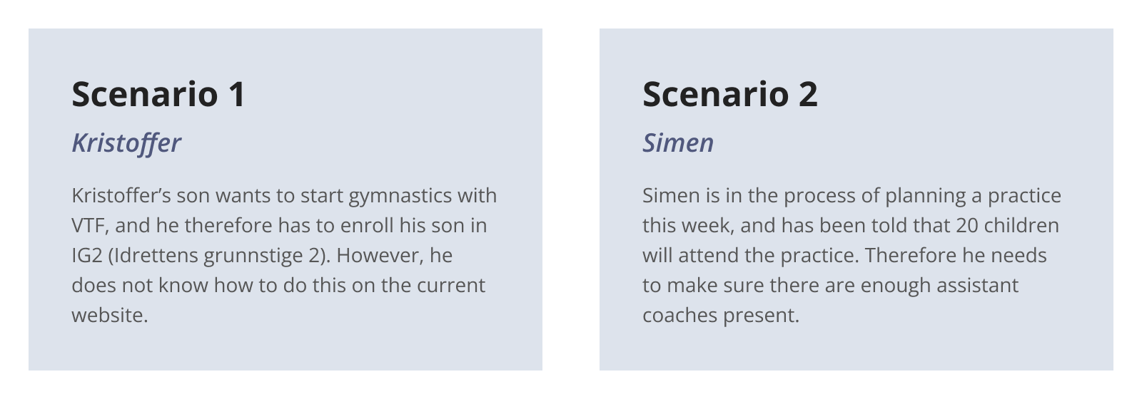
Both experience the current platform as confusing and unclear, which makes it harder for them to complete various tasks. Therefore we also created scenarios describing a typical situation they find themselves in.
Final solution
Solution to scenario 1 (Kristoffer)
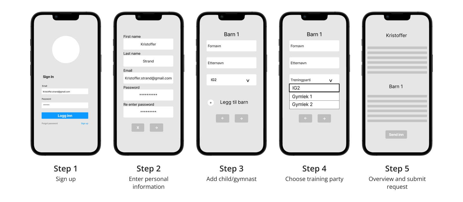
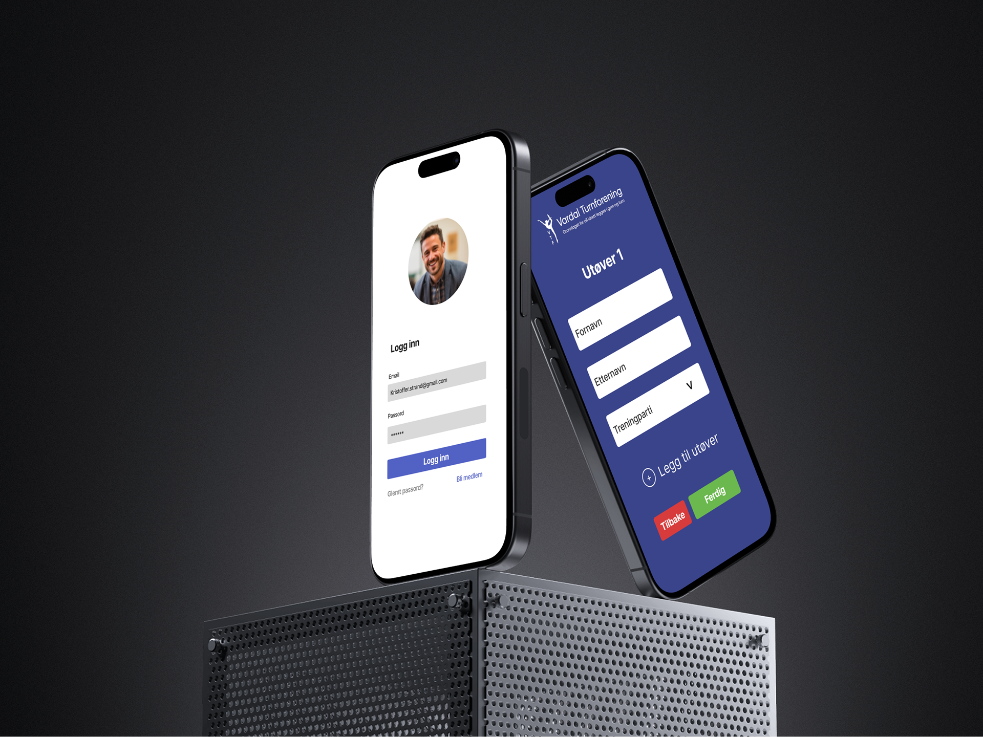
For Kristoffer, we redesigned the sign-up flow to make it more intuitive and efficient, enabling him to register his child for gymnastics with less confusion and more clarity.
Solution to scenario 2
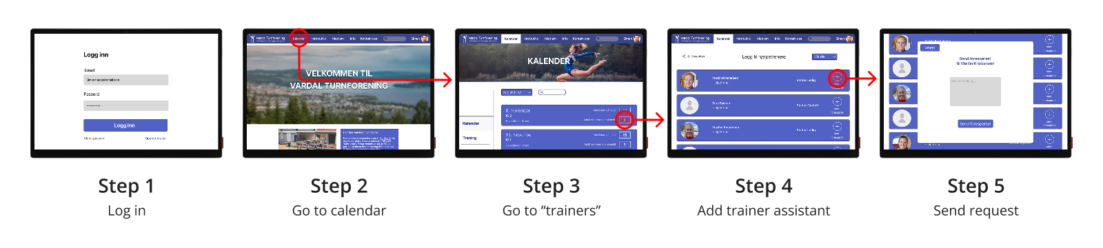
For Simen, we designed a solution that allows him to easily add new trainer assistants by sending them requests directly.
Color palette & visual design
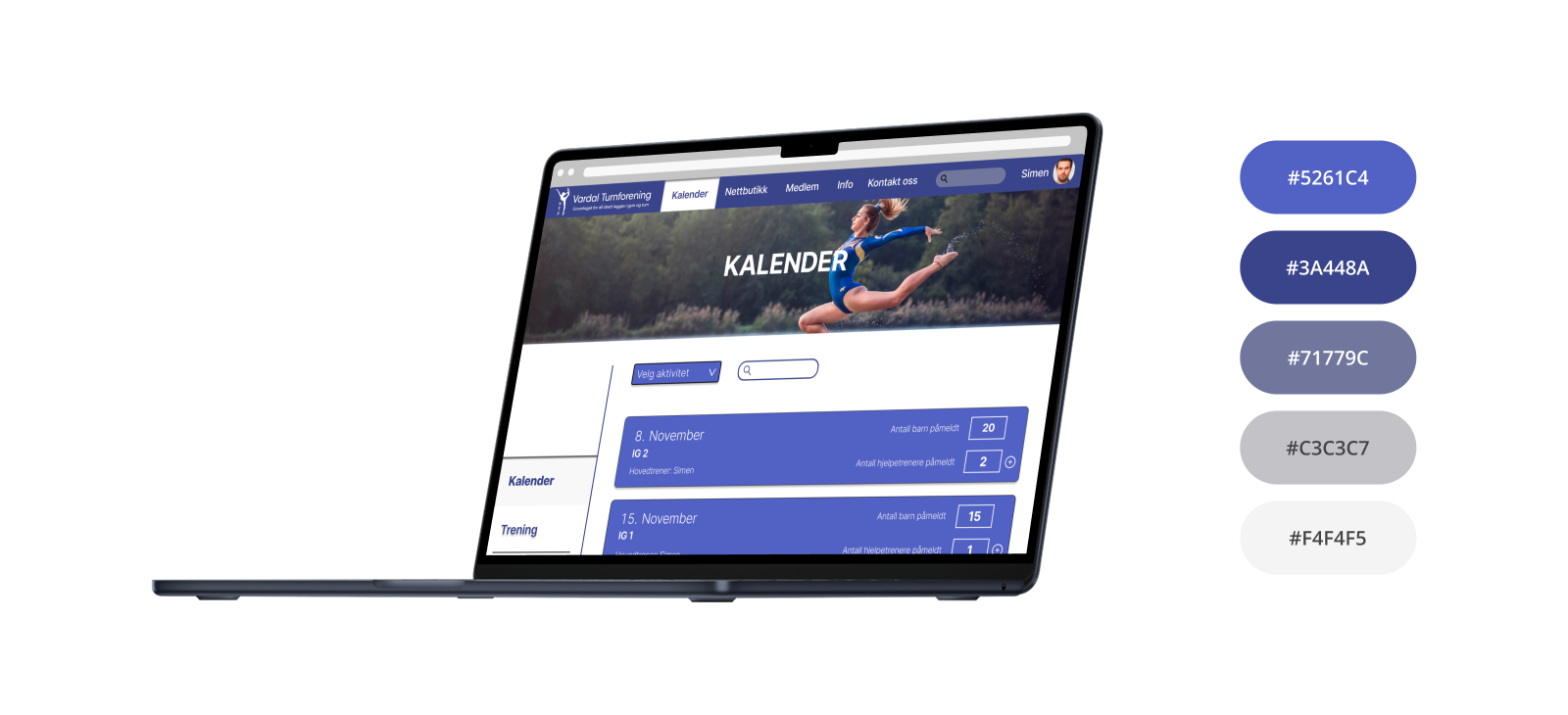
Although the primary focus was on improving the information architecture and user flow, maintaining Vardal Turns' visual identity was also put into consideration throughout the design process
What I've learned
• The importance of clear information architecture and intuitive navigation for efficiently performing everyday tasks - such as sign-ups and finding schedules.
• How unclear information architecture can create unnecessary friction, making tasks harder to complete and ultimately reducing conversion rates
Further improvements
• Pilot testing the design with real users, measuring satisfaction and efficiency
• Create a service blueprint illustrating how the improved platform facilitates interactions between gymnastics parents, trainers, and administrators